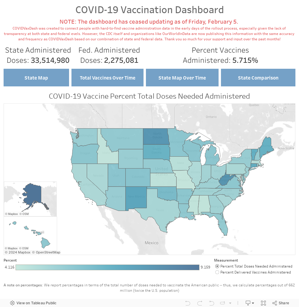
Now that my semester has wrapped up, I've found myself with quite a bit of time to work on some projects, and recently I've taken on a fairly big one (that for once is not plane-related!). Last week, I started looking for data on COVID vaccinations, but I wasn't able to find any numbers on actual administrations. So I decided to build a dashboard that scrapes state department of health websites for the most updated numbers I could find. This is definitely an ongoing effort, due to the fact that only ten states currently publish vaccine administration data; however, more are adding it every day, constantly giving me a bit of new work to do.
As I mentioned, I wanted to build an automated dashboard that would retrieve the data itself to further develop my data analysis and coding skills in Python. After learning how to use some basic scraping packages in Python (particularly Selenium and BeautifulSoup), I thought it would be pretty easy: just find the website and scrape the data every few hours. Easy, right? Of course it wasn't! Some states publish data in very weird formats, whether in Tableau or Microsoft Power BI dashboards that make scraping very difficult, so I had to be pretty creative sometimes.
For example, Colorado publishes its data as an image within a Tableau dashboard, which is pretty much impossible to scrape using conventional means. So, I had to get creative and ended up writing a Python script that takes a screenshot before cropping the image to the location of the data and using an image recognition package to convert an image of vaccines administered to a number. Such has been the case with a number of states, and it's been quite the adventure playing around with Python to figure out the best way to extract the data.
This has also been an interesting project to work on because the data is changing so rapidly -- forty states haven't published any data yet (so there's a lot of work left to do once they do.) Similarly, some states change the formatting of their dashboards randomly, which means that constant revisions to the code are necessary. After collecting the data, I publish the results to a MySQL server and then use Tableau to extract this data and refresh the public-facing dashboard accordingly. I've tried to make it as automated as possible, but I do have to manually run the Python script on my computer due to limitations from my student license of Tableau.
Overall, this has been a fun project to work on while stuck in my apartment in Providence after classes ended -- it hasn't been easy, and there's still lots of work to do, but it's fun aggregating important data few others have attempted to work and learning new Python data analysis skills along the way. I've also placed the dashboard below if you'd like to take a look. As always, feel free to email me or leave a comment if you have thoughts. And I promise I'll be back to planes soon -- lots of interesting research to be done there!